
When I first started as a Senior UX Designer at GTxcel, I was assigned to work on the Rivista Content Management System (CMS) – a website publishing platform designed for Magazine publishers. It had recently been acquired as part of a merger and we needed to learn all about its users and how well the product was helping them meet their goals. I partnered with the product manager for Rivista and we collaborated to conduct the research, and analyze the data. We discussed the findings extensively within the engineering and product teams and used it as a blueprint for future development plans. I also presented an overview at a company-wide meeting.
Executive Summary
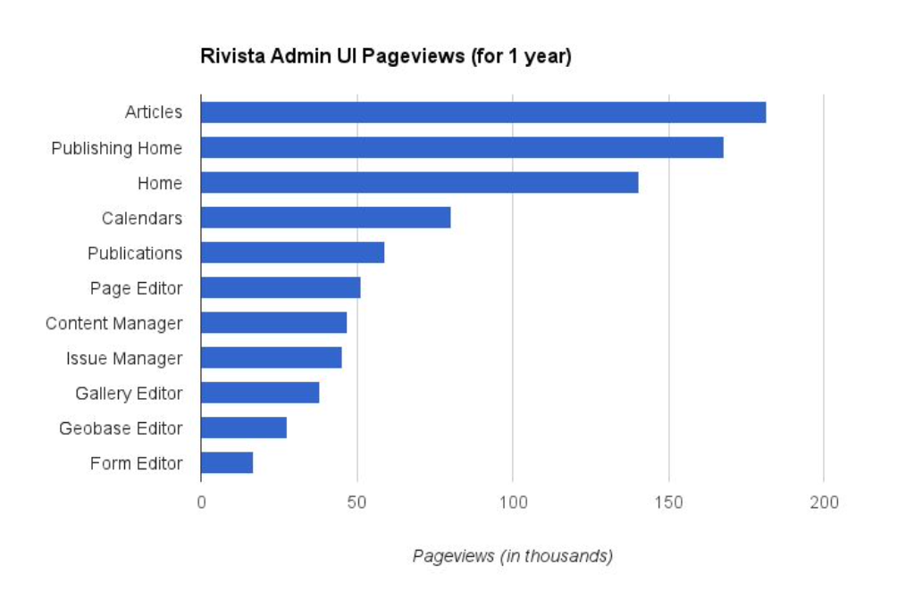
- We analyzed web analytics for the Rivista admin UI.
- We interviewed and remotely observed six Rivista users at customer organizations, and two internal GTxcel users.
- We asked participants to organize the existing menu items using an online card sort.
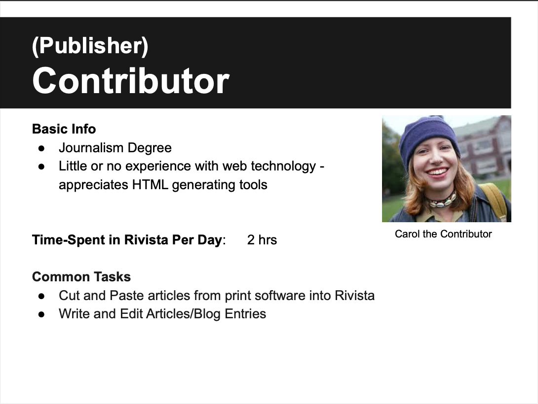
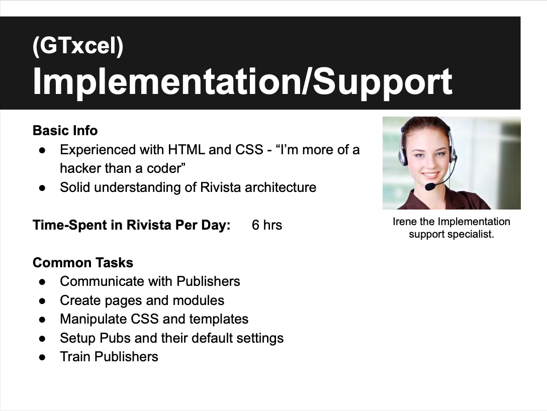
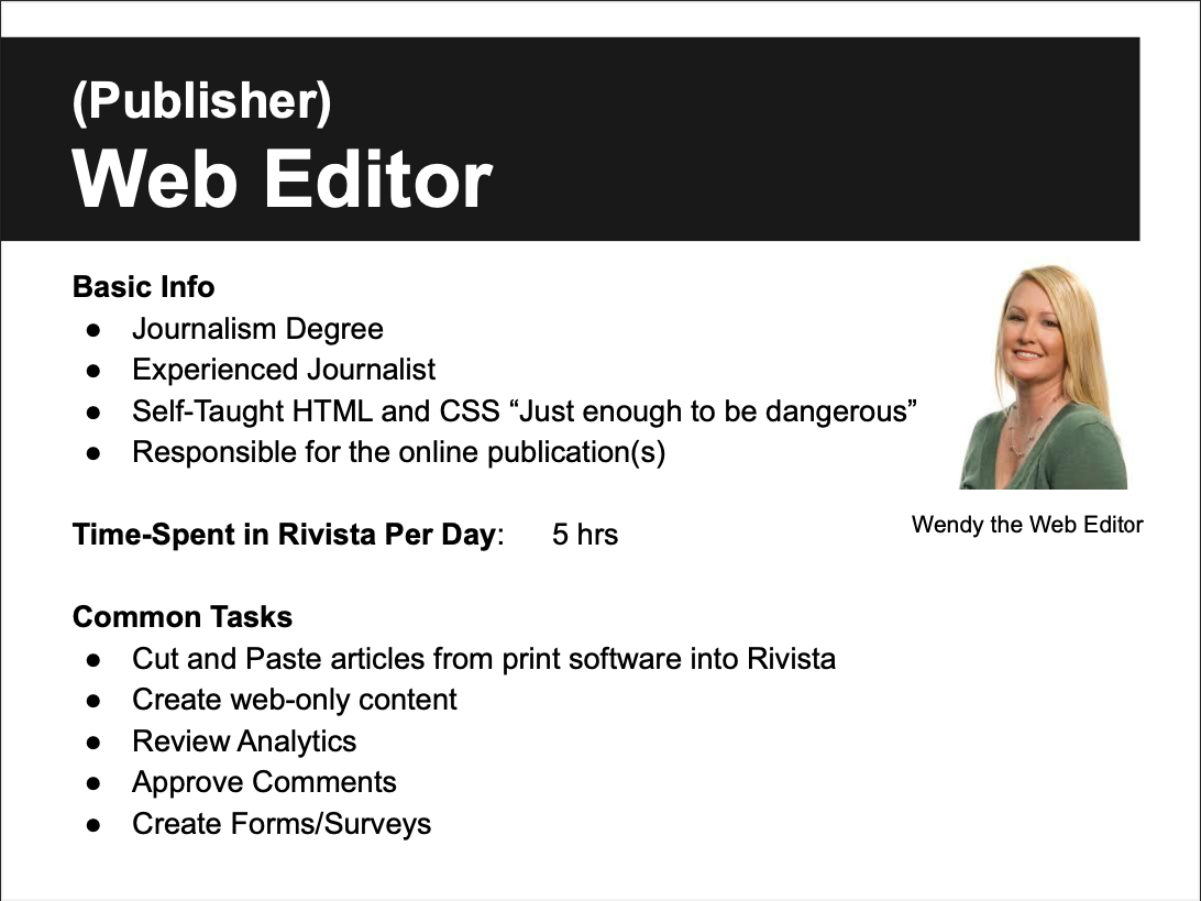
- We created 4 user personas and documented their workflow.
- We identified and prioritized over 70 opportunities for improvement within the Rivista admin UI
Analytics Data
Interviews
We recruited participants for and conducted 1 hour interviews and remote observations of Rivista users. We had many “aha!” moments during the interview and observation process. We captured notes in an excel spreadsheet for analysis. We learned about what was working well and what wasn’t. We learned about the types of Rivista users and their workflow. We documented our findings with many bullet points and we used the data to create personas and user flow diagrams. I stitched together a highlight reel of key moments to add color to the findings and help team members empathize with the various users.
Personas

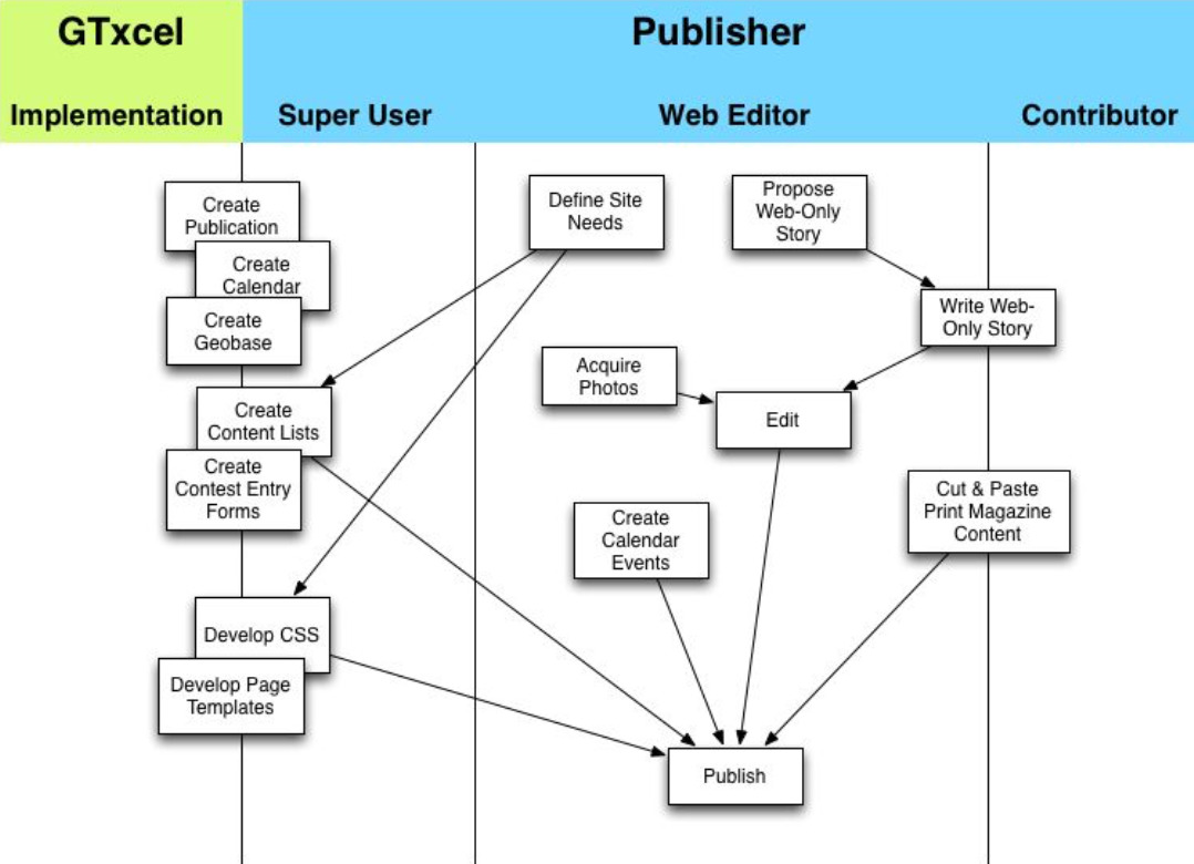
Digital Magazine Publishing Workflow
I created a user flow diagram to map out the workflow across the various user personas and digital production tasks.
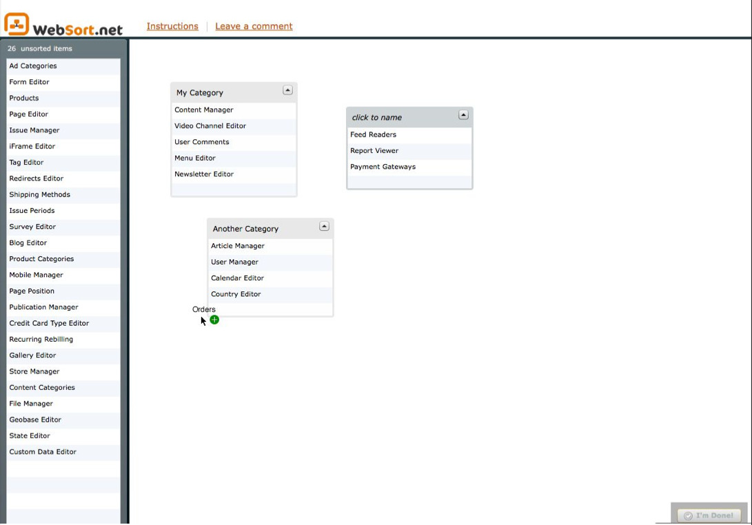
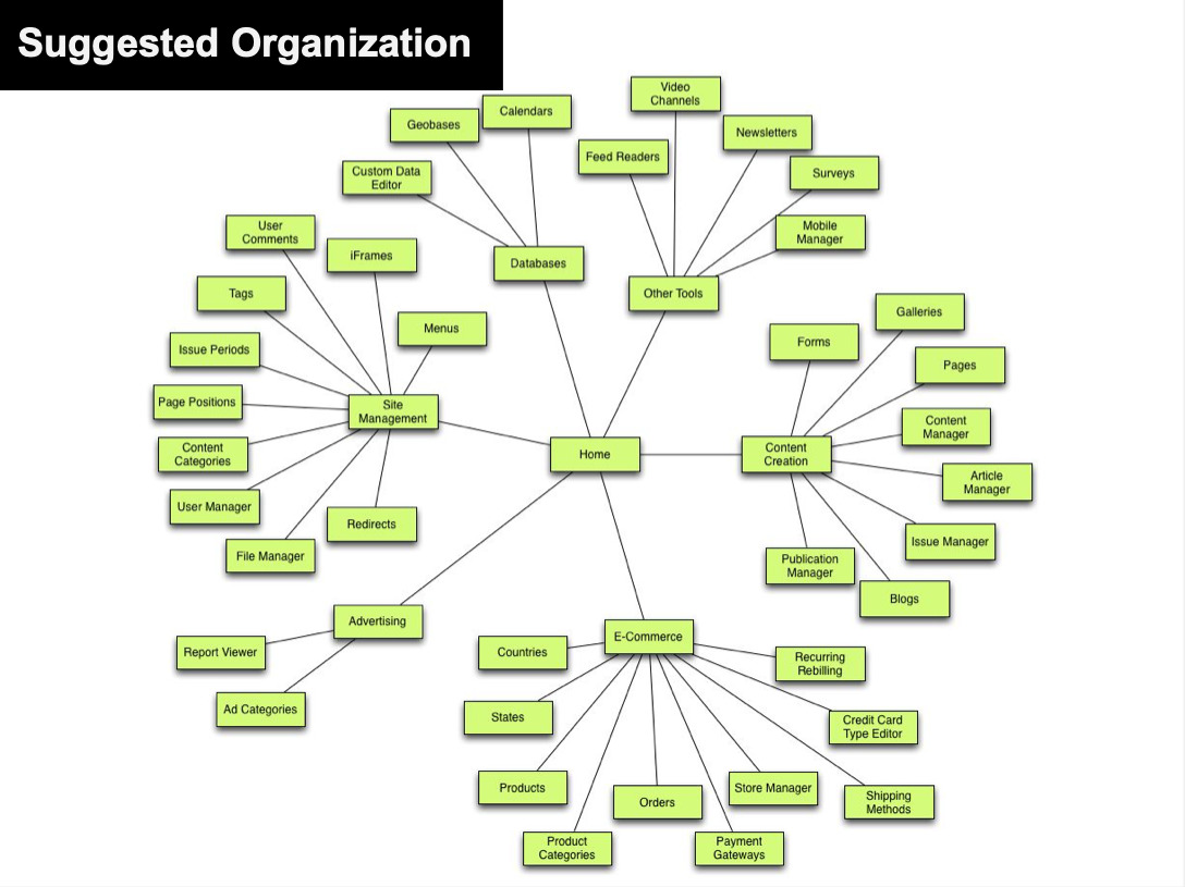
Online Card Sort
The Rivista administrative interface had sprawled out over many pages and sections. I wanted to explore ways to improve the information architecture so that it aligned more closely with the users’ mental models. I created an online card sort on WebSort.net and sent a link to interview participants to complete after the interview.

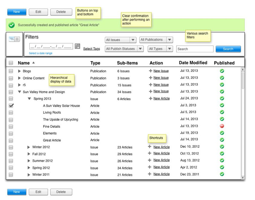
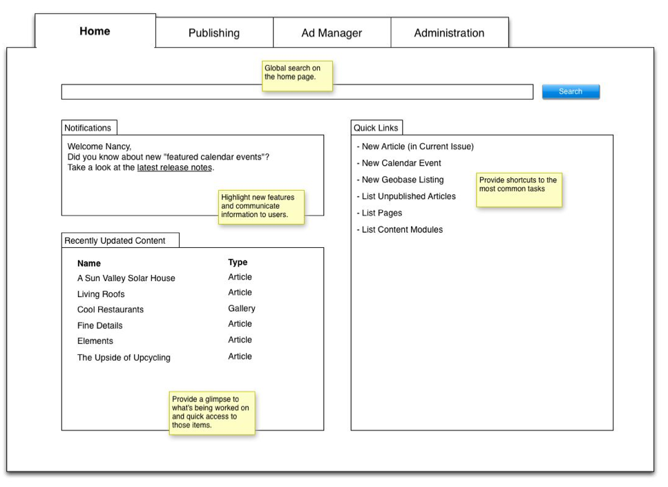
Wireframes for Potential Improvements
The research process provided a wealth of ideas for improving the administrative user experience. I created and annotated wireframes to explore those ideas, get feedback, and begin to socialize them across the broader team.


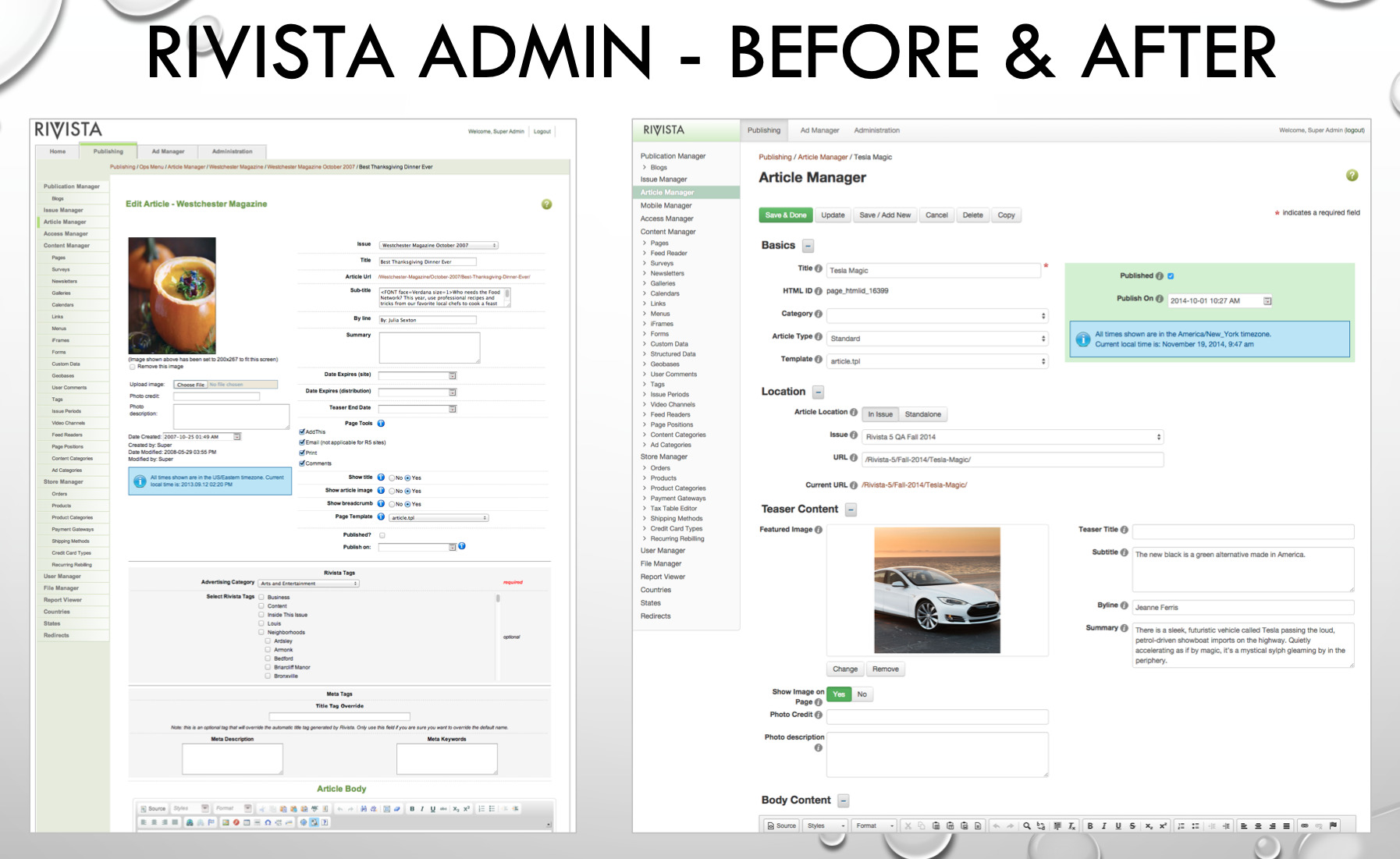
Before and After
The following screenshots help to contrast the complicated and unappealing user interface at the start with the streamlined and attractive interface as we delivered incremental improvements to the user experience as we also delivered a constant stream of new features and improvements to the core product functionality.
Conclusion
This project was a great example of my user-centered approach to design. I spearheaded the project and collaborated with product managers and cross-functional team members to make it happen. We implemented many improvements to the user experience with these findings as a foundation. We worked through the changes iteratively and continued to collect additional insights and evolve our understanding as we released the changes and enhancements as we also delivered a constant stream of new features. As a result, editors published content faster and with fewer mistakes.